
I joined the Analytics Team in Munich Re America from May, 2022 to August, 2022 as a UX Front-end Engineer. During the internship, I had the honor to work on the Market Intelligence project. Market Intelligence is a website which hosts reinsurance-related resources for internal management people to use. This website includes a data visualization web app called Market Cycle Nowcasting.
The original Market Cycle Nowcasting web app had an unfriendly user interface, which limited its functionality and confused users. So the team wanted me to redevelop the user interface of Market Cycle Nowcasting to improve user experience. The team also wanted a new homepage for the existing Market Intelligence website, which could be used as an editable template for other projects.
As the only frontend person on the team, my contribution to the team include:
This product has been launched as a minimum viable product in August 2022 for internal use. I also modified the home webpage into an editable template for future use.
(My mentor from Munich Re allows me to include the mockup and style guide in this portfolio, but some details could not be revealed. Please contact me if you are interested.)

I redesign and develop the user interface of the existing product to smooth user flow and allow users to explore data to a greater extent. This task took me 10 weeks in total.
The first thing I do was creating a style guide for the website, so I could have reference when designing web pages for the Market Intelligence website. It will help improve the consistency of the website. Based on the existing branding guide and the feedback from my team members, I developed the new style guide for the market intelligence homepage.
It remains the primary colors from the company: blue and green, and I add yellow and purple to the palette for a feeling of energy and youth, as part of the team's spirit.
I also tested the guide from the accessibility aspect, which includes font size and color contrast.
(Scroll down for the final version)
The Market Cycle Nowcasting web app is a data visualization tool for the management team of Munich Re to gain business insights. Users will choose different lines and applicable filters as input, and this tool will generate the corresponding line chart.
Before I joined the team, my team members had created an initial version of the Market Cycle Nowcasting web app. This version is functional but very confusing to use.

I first communicated with my team members to understand the purpose of the app and how it functions. Then I did a heuristic evaluation of this product.
Severity Rating
0 = I don't agree that this is a usability problem at all
1 = Cosmetic problem only: fix if time is available
2 = Minor usability problem: fixing this should be given low priority
3 = Major usability problem: important to fix, given high priority
4 = Usability catastrophe: fix this before product can be released

Besides the heuristic evaluation, I, as a novice user, was confused by the interface: What are the applicable filters for different lines? When I choose the filter, will it apply to both lines or one of them?
With my evaluation and questions at hand, I had a discussion with my mentor to prioritize the task and have a better understanding of the goal of this app.
After the discussion, we set the below tasks as the main goals of my redesign.
Below is the suggested user flow for error prevention.

Once I have the user flow in mind, I created an interactive mockup in Figma to demonstrate my ideas to the team. I refined the mockup several times based on the feedback. Below is the final prototype I made for the basic version that achieved the goals of my redesign.

Goal #1: Better visual hierarchy, aesthetic and minimalist design
Goal #2: Allow users to explore the data


Goal #3: Enable applicable filter and filter options based on the line selection.

Goal #4: Prevent users from choosing duplicate lines and help users fix errors.
Goal #5: Retain users' selection after page refreshes and allow reset to default.
One nice to have feature that our team wants is to allow multiple, weighted choices for the LOB filter. Below is my approved mockup.
The advanced version still meets the goals mentioned above. But for the error prevention, it not only needs to prevent duplicate lines, but also needs to check if the entered weight is a positive number and if the weight total is one hundred.


With the mockup and the style guide as a reference. I programmed the user interface for both the basic version and advanced version to create a minimum viable product. Both versions work with the backend smoothly to generate the graph. Languages used in the process are Javascript, HTML/CSS, and Python Flask.
(The final web app is for internal use only so general netizens couldn't access it.)
Once I'm done with the user interface redevelopment, I continued to work on the homepage redesign and development of Market Intelligence. The original homepage doesn't have a organized information architecture, so my goal was to create a responsive and functional web page with improved layout. I later made the homepage an editable template that could be used for future projects. This task took me 1 week in total.

I started my project by evaluating the original homepage. The previous home page for Market Intelligence has two main issues:
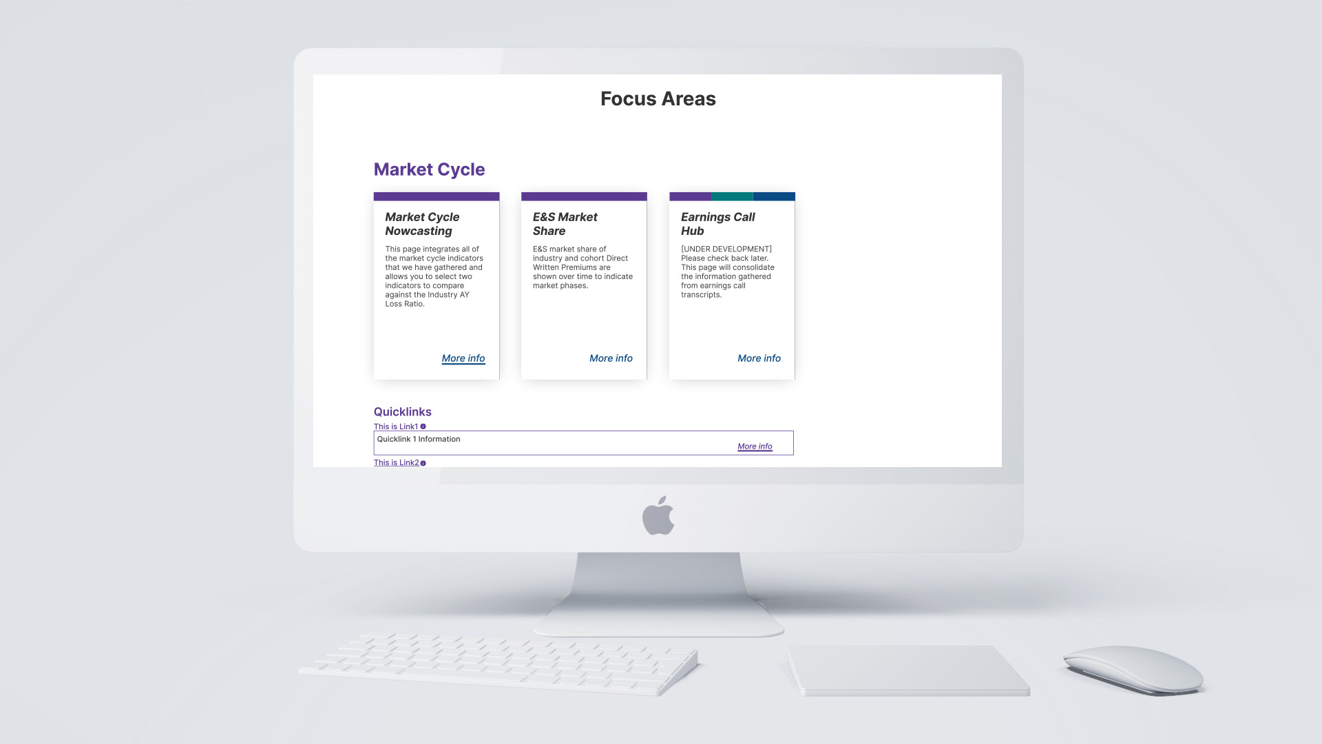
Once the style guide was approved. I started re-organizing content on this homepage. I observed that all content on this page can be categorized into 3 categories: Market Cycle, Emerging Topics, and Client Intel. So this became the main criteria of my arrangement.
I created several versions of UI components in Figma, and had a series of discussions with the team. Below are the components approved by the team.

I added a consistent navigation bar across the website, so users could easily navigate to their desired part without scrolling or going back to the homepage. The website's name on the left takes users to the homepage. The tabs on the right are the 3 main categories and the contact. Under each main tab, there are links to subpages or to the quick link section on the homepage.

The original banner has the problem of taking up too much view height. And the separate website introduction paragraph also occupies some spage, causing the users to further scroll to get to the main content.
In order to fix this issue, my final solution is to condense the content, putting the banner image on the left and introduction paragraph on the right, which also includes links to the corresponding sections. Users could click these links for quicker access to the information, or they could click the downward button to avoid scrolling.

Originally, all the content are stacked and represented with cards. There's no specific order or visual hierarchy in the arrangement.
In my new design, I decided content to three main groups, each of them represented by a different color. Each card also has a colored badge, indicating which category it falls under.
To save space, quick links are not contained in cards. Users can click on the link to be navigated, or they could click on the information icon to show the collapsible and see the description of the link before accessing it.

A footer across all web pages is also missing in the original design. In my solution, I put contact info in the footer so users can access it on whichever page they are on.
The tags used to be in the main content is also moved to the footer, together with the logo, to create a more complete branding. At the bottom is a auto updated copyright claim to increase the credibility of the website: users feel more comfortable when they see the website is constantly updated.
With the approved mockup as a reference, I coded a fully functional homepage with Python Flask, HTML, CSS, and JavaScripts. I also modified it to an editable template and created a documentation for future use.
(The final website is for internal use only so general netizens couldn't access it.)


From this internship, I learned:
(Thumbnail by Conny Schneider on Unsplash)

